Intranet redesign
<about this case study>

PRODUCT TYPE
Internal app
ROLE
Solo UX Designer
STATUS
Released
Outdated Intranet Portal required a redesign
APS Group, a global marketing agency with over 1000+ employees, relies on a variety of daily digital tools like Outlook, Microsoft Teams, along with APS homegrown websites and applications.
Despite having around 150 tools in use by 2020, the APS Intranet Portal, created years ago, featured only a handful and soon became outdated and neglected within the company.

Old Intranet Portal
🚧 Problem
Employees started to complain about the old Intranet and a lack of an up-to-date single source of truth showing all the tools in one place.
🎯 Objective
Update the Intranet Portal to enhance APS employees' experience by centralizing access to digital tools for daily work.
Inside the agency
Methods applied:
To get to know the target audience of the Intranet Portal, I've began documenting everything I knew about the people who work at the APS and their working environment. A lot of insights were based on the provided documentation, shadowing and my personal observations as I've been working here as well for quite a while. Here's a quick digest of what I've learned.

👥 1000+ employees from various backrounds
🌍 Global presence: Europe, America, Asia etc.
🎨 Diversity of professions: Design, Engineering, Account Management, Sales etc.
💻 Hybrid working mode: home+office
⏳ Busy atmosphere: tight deadlines, big projects
📄 Excess of internal FAQ & training documentation shared among employees
🛠️ Due to scattered way of working the set of tools per discipline/team may vary quite a lot.
👋 Employee onboarding is custom-made for every newcomer incl. introduction to tools
🔓 High security measures require tool access upon request via admins
Unwrapping user problems
Methods applied:
So, how come employees were complaining so much about the old Intranet Portal? I've dived deeper into the topic and identified several issues that ideally a new solution should address. Here's a short summary of these issues:
💾 Outdated & irrelevant page contents
Only 18 out of ~150 tools were listed on the old Intranet Portal. Nobody refreshed this page for years. No surprise employees had abandoned it and started using alternative solutions like bookmarks and docs.
Number of tools shown on the old Intranet Portal
18
VS

Number of tools used by APS Group employees in reality
~150

♾️ Long URLs & Tab overload
Not only employees grapple with the challenge of memorizing lengthy APS homegrown website URLs, they also rely on bookmarks and tabs for assistance. While this strategy provides initial relief, it ultimately clutters browsers and potentially hampers productivity, focus, and increases stress levels among employees (Able.ac, 2022).
"Tab overload" illustration by Elena Lacey
Illustration made by Abdul Akbar
🎨 Lack of brand look & feel
The Intranet Portal lacked the essence of the APS brand, with users even describing it as "abandoned" and "not modern", highlighting the disconnect between its appearance and the company's identity.

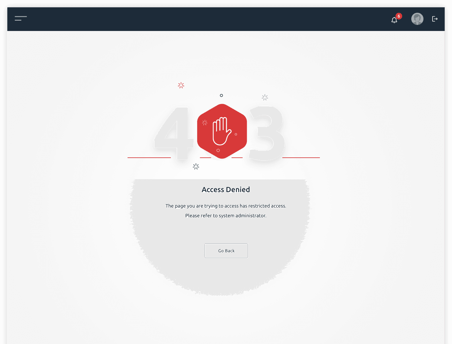
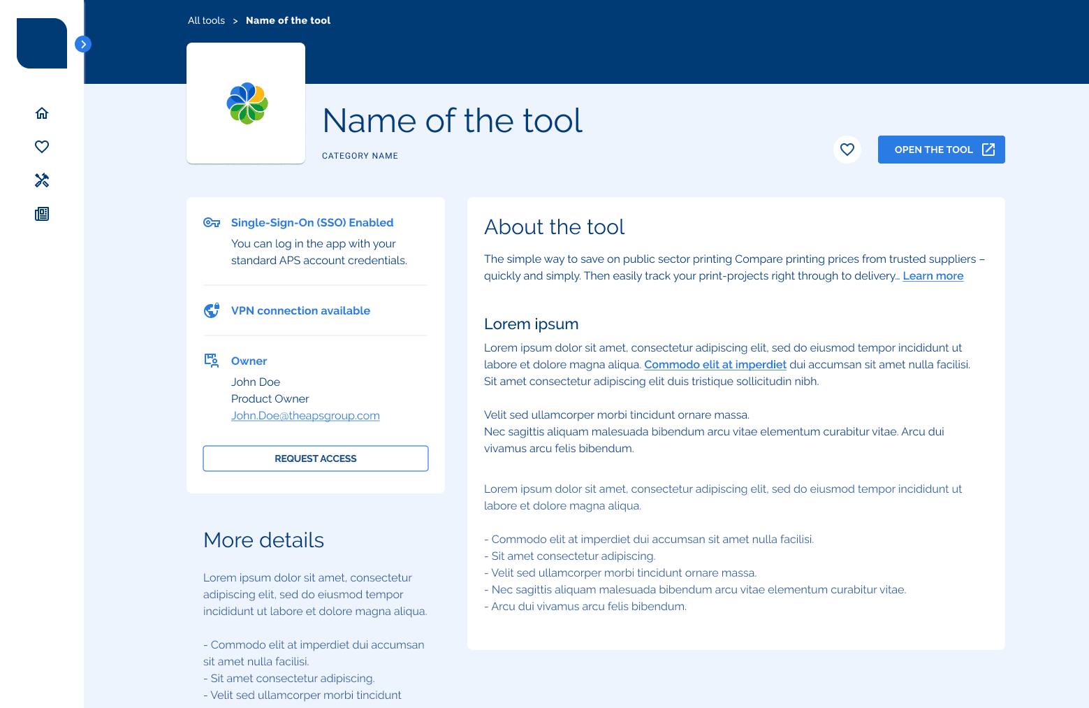
🔓 Slow access requests
Unlike standard applications such as Outlook and Microsoft Teams, access to homegrown APS portals and webshops required a manual outreach to people. This was causing confusion and unnecessary effort on employees' part.
ℹ️ Lack of essential details
Apart from cards redirecting to a specific URL, there was no other content describing the tools. For example, what's the purpose of the tool, who is the owner, and so on.
And in case of practical questions, there was no FAQ or a link to the user guide, leaving employees on their own.

Designing a solution: …
Methods applied:
<In a nutshell about the vision for the solution>
Exploration, inspiration
….
With search and filters
Snapshot competitive analysis: UK print webshops
Library of tools - Hifi
…

Quote comparison mockup
My favourite tools page
…

Quote comparison mockup
Single sign on
…

SSO
Request access
…


Quote comparison mockup
Post-release research highlights
Methods applied:
A few weeks after APS ONE was released, we sent out a survey to all employees to get their initial feedback about the solution. N = 137 responses were recorded.
Demographics
As expected, most of the respondents were from the Account Management department. However, unexpectedly, Sales department was represented even more than the Creative and IT departments.

Most of respondents said they'd been using the new Intranet
Only 11% (N=9) of respondents said they did not use the new Intranet. This was a very positive sign to us! However, we cannot be certain in these numbers since in another question more people stated they were not yet familiar with the new intranet. There should be a way to verify usage more objectively.

❤️ Top 5 favourite things
Selecting “Favourite applications”
Ease of use
Searching for an application
Personalisation of homepage
Filtering through applications
🧐 Top 5 things that are missing
A few sites and applications are still missing in the library
More content such as news or updates about the applications
More advanced searching/filtering (e.g. per use case, department etc.)
Adding own bookmarks feature
Enhancing intranet with useful documentation like guides and policies
Learnings & Next steps
🤝 Lots of interest in joining the "Power User" community
36% of respondents (N = 50) would like to participate in future user tests and give feedback. Another positive sign that people "care" and are open to conversation. We should use the momentum!
🚀 Basics released, yet there's demand for more
Acknowledging that this is the initial release, we recognize its coverage of basic needs. However, user feedback indicates a desire for more features and functionalities. Addressing these requests will be a focus for upcoming releases.
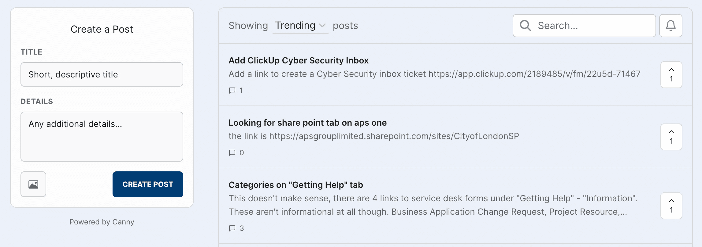
🙋 Introduction of Canny.io to engage with users
For more transparent and engaging feedback gathering, it was decided to use Canny.io. Users can now post their suggestions and upvote someone else's posts. Also, this way we can communicate about the roadmap by showing statuses of all requests.

🧭 A need for more objective insights into usage
When we directly asked through surveys, we encountered a mixed bag of responses. Some participants who claimed unfamiliarity with the intranet also reported frequent use. To gather more objective data, implementing web analytics is crucial. This tool can provide a clearer picture by capturing real, unique visits and usage patterns.
Contact me
d.jerjomcenko@gmail.com
©Darja Jerjomcenko - DarjaPixel 2023